
Tips on Hanging Artwork & How to Create a Gallery Wall


Your blank walls are your own private museum. Art is the heartbeat of a space. The artwork that you hang on your walls is there to inspire you and enhance your world.
When planning a space I often think of the artwork as dressing the walls of the room in
much the way that I think of getting all dressed up for an event or special occasion. A
plain white wall is functional but to create the warmth and interest we need a little
“dressing up.” One of my “secrets” in designing the interiors of model homes is to
think about color, theme and proportions. So, I often select the artwork before I decide
on the wall color, and definitely before selecting accents like accent pillows, throws and furnishings of the room. Here artwork inspires the room and reflects the owner’s love of bright colors,
nature, and boating.

Here are some rules on hanging artwork that seem to ring true whatever you are hanging.
On an open wall, place the center of a single picture 57 to 60 inches from the floor.

If hanging artwork over a sofa or bed try to keep the lowest point of the work no
lower than 6 to 10 inches above the piece of furniture.
Finally, my great installer always considers the height of the ceiling and size of the
room and adjusts where we need to.
Also consider the size of the wall in deciding the size of the artwork that you will be
hanging.

Setting Up Gallery Walls

Here are some tips on creating gallery walls in your space:
Plan Your Layout — I like to plan by placing my artwork on the floor. If you want, you can put craft paper or even old wrapping paper on the floor first. Then draw around each to get the exact size. I usually just take a photo of the final layout and take my time hanging one picture at a time on the wall.
To get the flow that you want - make the distance around each piece of artwork the same. Two to three inches usually works well. Consistent spacing is so important!
I like to group according to the following and it seems to always work. Go by color so that each individual picture repeats the same or some of the colors, by common theme (butterflies, nature, or a famous designer) and finally I use the same color frames. The style of the frame may vary but the same color carries your eye around the entire gallery.

Think about the width of the gallery wall. The most common and often appealing arrangement not extend past the furniture that is under it or some books teach to go no wider than two-thirds of the width of the furniture.

Gallery Walls can be many things - artists that you collect and admire, themed
displays, or even written quotes. I use gallery walls in my personal home. I love Ansel
Adams photography so I have a collection of his prints in my master bath. Even on a
day with inclement weather it feeds my soul to see his beautiful photos of nature. I am,
also inspired by quotes and like to used framed wise words for gallery walls.


One of my favorite gallery wall motifs is travel. This can be a blend of your favorite personal travels, whisking you away on that adventure whenever you look at it. Or a mix of your personal photos and beautiful locale-themed art. Below are a collection of some of my favorite Nashville travel posters. All available in my Feather Your Nest shop to ship free.


Shop Nashville Music Garden Poster 
Shop the Bluebird Cafe Poster 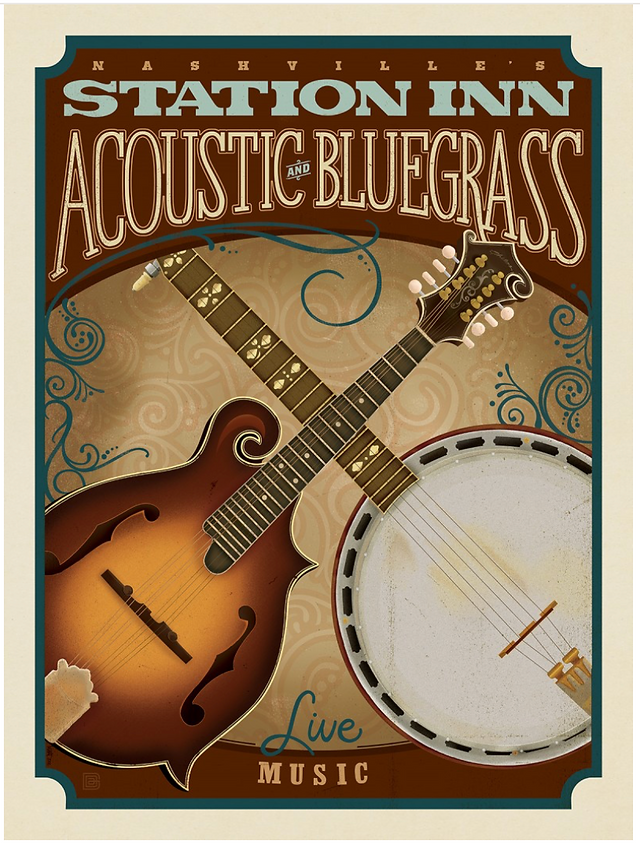
Shop the Station Inn Poster 
Shop the Downtown Broadway Poster
Click to browse.
DIY Tools that that you will need to install single works of art or gallery walls
A LEVEL: If you want to get fancy a laser lever is very helpful in hanging multiple picture on one wall. Or an old fashioned one like your father used is fine. You need a level - fancy or plain.
Tape Measure
Pencil for marking
A cordless drill and of course screws, nails, wire
These are a couple items that I like from Amazon, or check your local hardware store, that make hanging so much easier.


Photo credits: Modern office Photo © Pavel Danilyuk for Pexels, Interior design photos by Joan Greene Design Studio


tỷ lệ kèo nhà cái thì đúng là nằm chình ình trên trang, kiểu “khỏi hỏi nữa nhé” nên nhìn cái là biết họ ưu tiên phần gì rồi. Mình lướt qua cho vui thôi mà thấy cách họ trình bày theo dạng bảng khá ổn, hàng cột thẳng, mắt không phải chạy vòng vòng như mấy trang toàn chữ với chữ; thỉnh thoảng kéo xuống còn thấy số liệu thay đổi liên tục, trông giống bảng điểm đang cập nhật hơn là bài viết kể lể. Có mấy mục nội dung đặt tiêu đề rõ ràng kiểu kèo nửa trận toàn trận hay 2 đội ghi bàn, bấm vào là ra đúng thứ mình cần, không phải đọc mở…
jd88 vip mình cũng chỉ tò mò bấm vào xem thử vì thấy mọi người nhắc hoài. Vào cái là thấy giao diện khá sáng sủa, kiểu bố cục thoáng nên nhìn một lượt là biết chỗ nào là nội dung chính, chỗ nào là thông tin phụ. Mình không ngồi đọc kỹ hay làm gì nhiều, chỉ lướt qua thôi mà vẫn thấy dễ định hướng, không bị “ngợp” chữ. Cái mình thích nhất là họ chia nội dung theo từng khối rõ ràng nên mắt đỡ phải dò từng dòng, nhìn gọn gàng hơn hẳn. Menu cũng đặt khá nổi, bấm qua lại mấy mục thấy phản hồi nhanh, không phải vòng vèo tìm nút. Nói chung cảm…
https://kjcpro.it.com/ bữa thấy bạn bè nhắc vài lần nên mình cũng ghé thử cho biết. Mình không đọc sâu đâu, chủ yếu lướt xem họ trình bày ra sao thôi. Cảm giác đầu tiên là trang làm khá gọn, chia nội dung theo từng khối nên nhìn không bị rối mắt. Có đoạn nói về mấy tiêu chí kiểm tra kiểu minh bạch với bảo mật khá nghiêm, đọc qua cũng hiểu họ đang muốn nhấn mạnh chuyện tiêu chuẩn. Mình thích kiểu tiêu đề đặt rõ ràng, kéo xuống là gặp các box thông tin tách bạch, nhìn một phát là biết phần nào đang nói về giới thiệu và phần nào là mốc phát triển, bố cục theo…