
Two Bedrooms, Same Floor Plan, Two Separate Homes

Updated: Jun 4, 2025

When starting a new project, the first question that I ask clients is, “How do you want the space to feel when you walk into the room?” The selections we make for furniture, window treatments and accessories will create the mood and intangible feeling of the space. Of course, paint color choices, floor coverings and lighting choices are part of the whole and help tell the story that you want to convey. Even small changes can dramatically alter the vibe of a room.
The following is the tale of two clients - same floor plan - condos across the hall from each and how different their master bedrooms turned out due to each owner’s style and draperies used.
Two of my clients purchased penthouse condos in the same building. Their homes are across the hall from each other, with floor plans that were exactly the same. Each couple’s style and needs were totally different. One client couple were moving from a 5th Generation farmhouse in Nashville. The other client couple owned a beautiful large home in Las Vegas and the condo that they purchased from the builder in the same building is a second home and retreat for them in the Greater Nashville area.
Both couples were about the same age, but their goals for their homes and styles are so different. The truth is no matter how many clients I work with each one has their own perspective and I see it as my job to bring their styles and dreams to life in their home.
Couple A — wanted their home to feel comfortable and welcoming. Words like warm, cozy, inviting and a place to gather and nest were on their list. They asked me about how to bring the generational feeling of their farmhouse to a modern building.

Here are some of the ways Joan Greene Studio created the space that feels like home for them:
Reused family heirloom furniture from their farmhouse. The nightstands next to their bed came from different areas of their former home. The stands are not identical, but both have marble tops which pulls them together and creates a cohesive feeling in the room.
The farmhouse had beautiful doors that lead from room to room. We worked with a furniture maker to create the headboard for their master bed. This way they were literally able to bring a piece of the farmhouse with them.
The master/primary suite has windows on two of the walls so we designed draperies that would enclose the room on two sides to give the room the coziness that they longed for. We worked with our installer and designed a continuous drapery rod system that turns the corner with no break in the system.
We designed a custom master bedroom closet to maximize space and usage.
The rest of the home is a mixture of modern furnishings, sentimental treasures and areas that each of the couple could make their own. For their great room we selected a cozy, traditional leather sofa with modern lines, a modern console and paired it with a family heirloom and sentimental dining room set. We finished the room with a piece of artwork that the husband brought back from his service during the Vietnam War. The modern and traditional live side by side and work together because of the colors, textures and themes that we selected for the space, as well as a rug that ties it all together.
Couple B — wanted their home to feel like an upscale hotel, very minimalistic, clean lines, easy to take care of. No clutter and a place they could come to with their carry-ons and settle right into.

Here are some of the ways Joan Green Design Studio created the space that feels like home for them:
For this home we worked with a vendor for custom shades on all the windows in the master/primary suite.
Then we softened the wall behind their bed with modern drapes. This treatment camouflaged the fact that the two windows on that wall are not centered in the room.
They accompanied me on shopping days to carefully curate each item in their new home. We spent days at retailers that are known for modern and clean line furnishings - RH (Restoration Hardware), Pottery Barn, West Elm, Michell Gold and Crate and Barrel.
We created an open and sparse space plan to keep the home uncluttered and open for the modern clean feeling that they wanted.
We purchased modern original artwork and our installer installed all the artwork and draperies.
Added custom accent walls with unique paint colors and wallpaper.
Purchased high end lighting fixtures for each room and arranged for the electrician to remove the builder grade fixtures and replace with fixtures that are the jewelry in each room.
We designed a custom master bedroom closet to maximize space and usage.
Interestingly, even though these neighbors have very different tastes and needs they both offered me warm hospitality when I visited after the job was complete. At Couple B’s home I enjoyed homemade banana bread fresh from the oven. At Couple A’s they asked if I was hungry and made me a quick meal. Hospitality is not about the furnishings, it is about the people who welcome you into their sanctuary, their home and share life stories. It is probably the best part of interior design - starting with an empty canvas and seeing clients enjoying their home.
When thinking about draperies and window coverings here are some things to think about:

Light, Sheer Fabrics: These create a soft, airy, and light atmosphere, perfect for a relaxed, calm, and welcoming environment. Think of a farmhouse or modern minimalist vibe. These 120" sheers are a go-to for me.
Heavy, Dark Fabrics: Thick drapes in deep colors make a space feel cozy, dramatic, or even more formal. They create a sense of luxury and intimacy, often seen in traditional or classic interiors.
Bold Patterns: Floral, geometric, or striped curtains can inject personality and energy into a room. Bold patterns are often used in eclectic, bohemian, or contemporary designs to add visual interest.
Neutral or Muted Tones: Curtains in soft, neutral tones (like white, beige or gray) can provide a more subdued, tranquil feeling, giving the space a timeless and harmonious look, often used in Scandinavian or minimalist styles.
Custom or Premade: Custom draperies will almost always be the most expensive choice. In some cases they are the only option and we have helped many of our clients with custom made window coverings.

How draperies can help create the mood:
Privacy and Softness vs. Openness and Light: Draperies also serve a functional purpose in adding privacy or controlling natural light. A heavy blackout curtain can make a space feel like a quiet, intimate retreat, whereas sheer curtains allow natural light to flood in, creating a bright, energizing atmosphere.
Textures and Materials: Your choice of drapery material (silk, linen, velvet) can either amplify the feeling of comfort and warmth or create a more structured, modern aesthetic.
Hardware, Rods, Clips Etc: The hardware completes the story. Whether you use a French return rod, modern rod with minimal finials or more elaborate each style should be considered and selected to match the desired look and mood.
As a general rule white drapes are a classic. My favorites are lined white linen or twill, hung approximately 2 inches from the ceiling or the edge of the crown molding. The above photo is a seating area that I designed for a model home for Regent Homes TN. The drapes soften the room.

In conclusion, by simply adjusting the colors, patterns, and textures of draperies you can completely change how a room feels. Whether you aim for a relaxing, cozy, elegant, or vibrant atmosphere, these design choices allow you to tailor the mood to fit your needs and style. These two bedrooms demonstrate this premise. Additionally, although the rooms are exactly the same, we selected different walls for the feature walls to meet the needs of the homeowners.
These are a few of my all-time favorite rods for ease-of-installation, versatility and clean design:

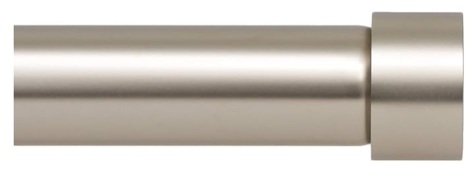


If you have questions about draperies, fabric choices or outside-the-box ideas to help create your ideal living space, let's talk! Until then, Sweet dreams.
Photo credits: Ivan Samkov, Joan Greene Design Studio Note: In some cases, we may receive affiliate credit of 3 to 5%.


xx88 today tối qua mình lướt lúc nghỉ tay vài phút thôi. Vào trang thì cảm giác dễ chịu kiểu không bị rối mắt, chữ nghĩa và tiêu đề đặt rõ nên kéo một đoạn là biết mình đang ở mục nào, không phải căng mắt tìm. Mình đọc nhanh bài giải đáp cho người mới, phần nói về giao dịch ngân hàng trong ngày trả lời thẳng “có” và ghi là hỗ trợ nhiều khung giờ, đọc cái hiểu ngay chứ không vòng vo; mấy khối nội dung tách theo heading nên nếu chỉ cần một ý là quét qua là bắt được, không bị dính một cục chữ dài. Nói chung dùng kiểu “xem cho biết” mà vẫn…
jw88 casino tối qua mình mở lên đúng lúc đang ngồi chờ bạn, tiện tay lướt vài phút xem trang họ trình bày kiểu gì chứ cũng không có ý tìm hiểu sâu, mà phải công nhận bố cục dễ theo dõi hơn mình nghĩ, kéo xuống là thấy các khối nội dung tách rõ ràng nên không bị rối mắt. Mình có đọc lướt phần “hành trình xây dựng” thấy họ để theo kiểu các cột mốc, nhìn giống timeline nên bắt nhịp nhanh. Chữ tiêu đề đặt nổi, đoạn nào ra đoạn đó. Không phải căng mắt dò. Với lại có một ô nhắc giấy phép PAGCOR để riêng nên ai quan tâm pháp lý chắc sẽ thấy…
https://xosoplus.mobi/ mình ghé thử đúng kiểu “xem cho biết” vì thấy mọi người nhắc hoài, không định soi kỹ gì đâu. Vào cái là thấy họ chia mục theo ngày khá rõ, kiểu XSMB ngày 19/07/2026 rồi bên dưới có phần dự đoán cho 20/7/2026 nên đỡ bị lạc. Mình thích nhất là khối bảng “Đầu Lô tô / Đuôi Lô tô” nhìn gọn, dạng cột nên lướt nhanh vẫn bắt được ý, không bị chữ số dồn một cục. Cuộn xuống cũng ổn vì tiêu đề và nội dung tách khối rõ ràng, nên đọc kiểu xem nhanh cũng không mệt mắt. Nói chung giao diện nhìn thân thiện, đặc biệt là khu “Đầu Lô tô / Đuôi Lô…
XX88 mình thấy dạo này hay xuất hiện nên tiện tay vào thử cho biết thôi. Ban đầu cứ nghĩ sẽ rối, ai ngờ giao diện nhìn khá thoáng, chữ không bị dồn dập nên lướt nhanh vẫn nắm được mình đang ở mục nào. Mình chỉ xem qua phần thể thao với casino là chính, thấy họ chia theo kiểu “sảnh” nên nhìn trực quan, không cần bấm nhiều vẫn ra đúng chỗ. Mấy khối nội dung trên trang tách rõ ràng, kéo xuống là thấy từng phần riêng nên đỡ bị lạc. Menu đặt chỗ dễ nhìn, chuyển qua lại giữa các mục cũng mượt, và tiêu đề từng khối nội dung được nhóm ngay từ đầu trang…
GG88 mình thấy dạo này bị nhắc hoài nên cũng bấm vào coi thử cho biết. Không phải kiểu ngồi nghiên cứu gì đâu, chỉ lướt xem trang sắp xếp có dễ dùng không. Vào cái là thấy giao diện khá gọn, tông nhìn hiện đại mà không rối, nên người mới cũng đỡ bị “lạc”. Mình thích nhất là cách họ chia nội dung theo từng khối rõ ràng, kéo xuống một đoạn là nắm được đại khái đang có gì. Mấy mục chính để ngay tầm mắt, bấm qua lại nhanh, cảm giác thao tác mượt. Nói chung nhìn thân thiện kiểu tối giản, không nhồi nhét chữ quá nhiều, các danh mục được nhóm lại khoa học…